SALTY CITY
Purpose in Every Layer
Salty City’s identity was built detail by detail, with the same care its founder brings to her platform. The process meant hours of sketching, iterating, and refining until every logo mark and visual element felt intentional. The effort was in the layering, balancing modern edge with personal warmth, professionalism with individuality.
What makes the brand guide meaningful is where it’s applied: across a platform that merges real estate, media, and lifestyle into one ecosystem. This identity wasn’t just a logo refresh; it was the backbone for a multi-dimensional brand, giving Salty City the tools to grow with clarity and confidence.
A body of work created during my time at The Conduite (Creative Strategist, 2025)
-
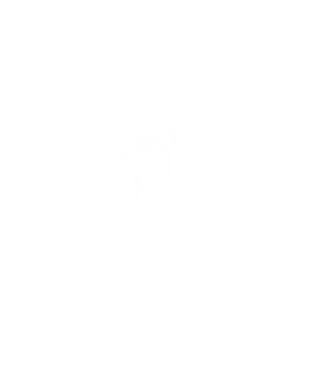
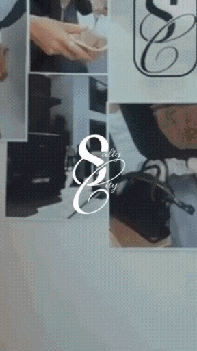
I led the rebrand of Salty City, a podcast, platform, and real estate business, by developing a full visual identity from scratch. The system included multiple hand-drawn logo options, custom wallpapers, story covers, and supporting assets, all built without access to the original discovery call.
-
The concept was to create a brand that felt as thoughtful and layered as its founder. With only a few details to go on, I relied on intuition and intention, crafting an identity that was personal, modern, and grounded in purpose. Every design element, from sketches to the final digital marks, was created custom to reflect the brand’s unique essence.
-
The rebrand was delivered with minimal revisions, underscoring the strength of creative alignment. Beyond refreshing the visual presence, the new identity gave the founder a brand that finally felt like her own, versatile enough for her platforms, yet distinct enough to stand out in a crowded space.
Logo Variations